

You have a Chromium fleet in containers: a current Chrome 152 User-Agent, the TLS fingerprint right, the timezone matching the exit region. Then you dump the geometry from one of your sessions:
screen.width        1920      window.outerWidth   1920
screen.height       1080      window.outerHeight  1080
screen.availWidth   1920      window.innerWidth   1920
screen.availHeight  1080      window.innerHeight  1080
window.screenX      0         devicePixelRatio    1
window.screenY      0         maxTouchPoints      0
Eight numbers, every one round and equal to another: the screen is exactly the window, the window is exactly the page, sitting at the origin of a display with no taskbar and no scaling.
No laptop looks like that, not because 1920x1080 is rare (it is the most common resolution there is) but because the gaps between these numbers are missing, and on a real machine they are always there.
What Each Number Actually Measures
All of these are in CSS pixels, not device pixels.
screen.width/screen.heightare the whole display, and on a HiDPI machine the logical size: a panel 3024 physical pixels across, at a 2x scale factor, reports 1512.screen.availWidth/screen.availHeightare what CSSOM-View calls "the available area of the rendering surface of the output device". The spec says nothing about what eats the difference; in practice a Windows taskbar, the macOS menu bar and pinned dock, or a Linux panel.window.outerWidth/outerHeightare the whole browser window, chrome included: title bar, tab strip, omnibox, bookmarks bar, borders.window.innerWidth/innerHeightare the viewport, and the spec is explicit thatinnerWidthreturns it "including the size of a rendered scroll bar (if any)" — whichclientWidthexcludes.window.screenX/screenY(alsoscreenLeft/screenTop) are where the window's top-left corner sits relative to the screen area's origin; on multi-monitor setups they can be negative.devicePixelRatiois device pixels per CSS pixel, moving with the display's scale factor and with page zoom — which is why it is so often a fraction.window.visualViewportdescribes the visible part of the layout viewport —width,height,scale,offsetLeft,offsetTop,pageLeft,pageTop. Note the asymmetry: itswidthexcludes a rendered classic scrollbar whileinnerWidthincludes it, so the two differ by the scrollbar on Windows and Linux, not at all on macOS.
The Arithmetic That Has to Hold
These properties are not independent: a session violating one of the following is not reporting an unusual machine but an impossible one.
availWidth <= widthandavailHeight <= height. The available area is a subset of the display.availHeight < heighton essentially every real desktop. Something is always reserved; both axes exactly equal is the signature of a display with no window-manager UI.innerWidth <= outerWidthandinnerHeight <= outerHeight. The page cannot exceed the window containing it.outerHeight - innerHeight > 0for a windowed browser. That difference is the chrome; exactly zero means kiosk, fullscreen, or no chrome at all.innerWidth <= screen.availWidthnormally. A wider viewport means the window is off-screen, or the numbers came from different sources.innerWidth - document.documentElement.clientWidthis the scrollbar width, and it lands in a small set: 0 where overlay scrollbars are the default (macOS, Android, ChromeOS), and 15 CSS pixels on Windows and Linux, where Chromium's Fluent scrollbars are non-overlay by default. The 17 often quoted is the Windows native UI metric, not the web-content scrollbar.screen.width * devicePixelRatioshould be a whole number, ideally a panel resolution that exists. 1512 x 2 = 3024. 1536 x 1.25 = 1920.screenX === 0 && screenY === 0withouterHeight !== availHeight. A window at the exact origin that is not maximised: nobody puts windows there by hand, and a maximised macOS window starts below the menu bar.
Where a Default Launch Collapses the Gaps
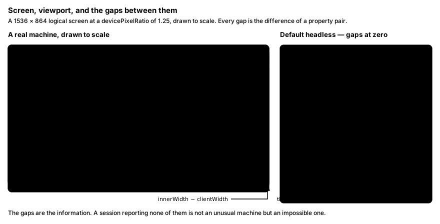
A headless browser has no window manager: no taskbar to subtract, no title bar to draw. Chromium's headless default window is 800x600, and in headless that size is the screen size. Pass --window-size=1920,1080 and you get a render surface with no chrome, so outerHeight and innerHeight are both 1080 (invariant 4 breaks), availHeight has nothing to subtract (invariant 2), and nothing positioned the window (invariant 8). That is the trap in --window-size arithmetic: on a real 1920x1080 laptop the viewport is never 1080 tall — the taskbar takes some, the chrome takes more, leaving something in the 900s.
Playwright's defaults do part of the job. Its Chromium contexts get a 1280x720 viewport at a scale factor of 1, applied through a device-metrics override rather than by resizing a window. With no screen set, Playwright passes the viewport as the screen size, and Blink's emulator sets the emulated screen's available rect equal to its full rect — so a bare new_context() reports screen.width === screen.availWidth === 1280 and screen.height === screen.availHeight === 720, invariant 2 failing on both axes by construction. Hence the separate screen option, which emulates a consistent window screen size inside the page, and only when a viewport is set.
devicePixelRatio in the Real World
A devicePixelRatio of exactly 1 is not impossible: a 1080p monitor at 100% scaling gives it. What is odd is a fleet where it is always 1 next to a screen size that implies a laptop panel.
The values in the wild cluster: 1 on unscaled 1080p and older desktops; 1.25 and 1.5 from Windows display scaling, where Chromium divides the reported DPI by a 96-DPI base (120 DPI is 125% is 1.25, 144 DPI is 150% is 1.5); 2 on macOS Retina and 200% Windows; and 2 to 3-and-change, often not integral, on phones. Page zoom folds in on top — pinch-zoom does not — so a real population has a long tail of odd values.
The same number reaches CSS as the resolution media feature, whose canonical unit dppx is fixed at 1dppx = 96dpi, so matchMedia("(resolution: 2dppx)") and devicePixelRatio === 2 had better agree.
The Media Query Surface Next Door
CSS media features, queryable through matchMedia(), describe the same machine from another angle:
pointerdescribes the primary input mechanism:none,coarseorfine.any-pointer, per the spec, "corresponds to the union of capabilities of all the pointing devices available to the user", and more than one value can match: a touchscreen laptop matches bothany-pointer: fineandany-pointer: coarsewhilepointer: finestays true for the mouse.hoverandany-hoverdo the same for hover: whether the primary mechanism can hover, versus whether any can.prefers-color-schemeandprefers-reduced-motionare OS-level user settings with genuinely mixed populations.
The contradiction to watch for is a mobile User-Agent over desktop pointer capabilities: a UA claiming an iPhone should bring pointer: coarse, hover: none, any-hover: none and a non-zero navigator.maxTouchPoints, smartphones typically report 5, desktops 0. pointer: fine with maxTouchPoints of 0 is a phone with a mouse and no touchscreen.
These are capability signals, and only touch emulation moves them: it flips the available and primary pointer types to coarse, the hover types to none, and maxTouchPoints off zero in one call. A mobile viewport flag touches none of that, so is_mobile=True without has_touch=True gives a phone-shaped viewport still claiming a fine, hoverable pointer. And has_touch=True alone sets maxTouchPoints to 1 — the CDP default when no count is supplied, a value almost no real device reports.
A Geometry Self-Check You Can Run
This dumps the whole set and flags relationships that cannot be true:
import json

from playwright.sync_api import sync_playwright

PROBE = """() => {
  const de = document.documentElement;
  const q = (s) => matchMedia(s).matches;
  const g = {
    screen_width: screen.width,
    screen_height: screen.height,
    screen_avail_width: screen.availWidth,
    screen_avail_height: screen.availHeight,
    screen_color_depth: screen.colorDepth,
    screen_pixel_depth: screen.pixelDepth,
    outer_width: window.outerWidth,
    outer_height: window.outerHeight,
    inner_width: window.innerWidth,
    inner_height: window.innerHeight,
    client_width: de.clientWidth,
    client_height: de.clientHeight,
    screen_x: window.screenX,
    screen_y: window.screenY,
    device_pixel_ratio: window.devicePixelRatio,
    max_touch_points: navigator.maxTouchPoints,
    visual_viewport: window.visualViewport ? {
      width: visualViewport.width,
      height: visualViewport.height,
      scale: visualViewport.scale,
      offset_left: visualViewport.offsetLeft,
      offset_top: visualViewport.offsetTop,
      page_left: visualViewport.pageLeft,
      page_top: visualViewport.pageTop,
    } : null,
  };
  const media = {};
  for (const s of ["(prefers-color-scheme: dark)", "(prefers-reduced-motion: reduce)",
                   "(pointer: fine)", "(pointer: coarse)", "(pointer: none)",
                   "(any-pointer: fine)", "(any-pointer: coarse)",
                   "(hover: hover)", "(any-hover: hover)",
                   "(forced-colors: active)"]) media[s] = q(s);

  const scrollbar_width = g.inner_width - g.client_width;
  const chrome_height = g.outer_height - g.inner_height;
  const mobile_ua = /Android|iPhone|iPad|iPod/.test(navigator.userAgent);
  const flags = [];

  if (g.screen_avail_width > g.screen_width || g.screen_avail_height > g.screen_height)
    flags.push("available screen area exceeds the screen");
  if (g.screen_avail_width === g.screen_width && g.screen_avail_height === g.screen_height)
    flags.push("no OS chrome reserved on either axis");
  if (g.inner_width > g.outer_width || g.inner_height > g.outer_height)
    flags.push("viewport larger than the window containing it");
  if (chrome_height <= 0)
    flags.push("browser window has zero chrome height");
  if (g.inner_width > g.screen_width || g.inner_height > g.screen_height)
    flags.push("viewport larger than the screen");
  if (g.screen_x === 0 && g.screen_y === 0 && g.outer_height !== g.screen_avail_height)
    flags.push("window at exact origin but not maximised");
  if (!Number.isInteger(g.screen_width * g.device_pixel_ratio))
    flags.push("screen width x devicePixelRatio is not a whole pixel count");
  if (q("(pointer: coarse)") && g.max_touch_points === 0)
    flags.push("coarse primary pointer with zero touch points");
  if (mobile_ua && q("(pointer: fine)"))
    flags.push("mobile user agent reporting a fine pointer");
  if (mobile_ua && q("(any-hover: hover)"))
    flags.push("mobile user agent reporting hover capability");
  if (window.visualViewport && visualViewport.scale === 1
      && Math.abs(visualViewport.width - g.client_width) > 2)
    flags.push("visual viewport width disagrees with the layout viewport at scale 1");

  return { geometry: g, media, derived: { scrollbar_width, chrome_height }, flags };
}"""

with sync_playwright() as p:
    browser = p.chromium.launch()
    context = browser.new_context()
    page = context.new_page()
    page.goto("https://example.com", wait_until="domcontentloaded")
    print(json.dumps(page.evaluate(PROBE), indent=2))
    browser.close()
Run it against a bare new_context() and you will get several flags; against your own browser, none.
Making the Numbers Consistent
Derive the viewport from the screen instead of picking both independently: choose a plausible display, subtract OS and browser chrome, and set the scale factor that display would have.
# A Windows laptop: 1920x1080 panel at 125% scaling.
# Logical screen: 1920 / 1.25 = 1536 x 864.
SCREEN = {"width": 1536, "height": 864}
TASKBAR = 40          # bottom taskbar, logical px
BROWSER_CHROME = 88   # tab strip + omnibox, logical px

UA = (
    "Mozilla/5.0 (Windows NT 10.0; Win64; x64) AppleWebKit/537.36 "
    "(KHTML, like Gecko) Chrome/152.0.0.0 Safari/537.36"
)


def open_desktop_context(browser):
    return browser.new_context(
        screen=SCREEN,
        viewport={
            "width": SCREEN["width"],
            "height": SCREEN["height"] - TASKBAR - BROWSER_CHROME,
        },
        device_scale_factor=1.25,
        color_scheme="light",
        reduced_motion="no-preference",
        is_mobile=False,
        has_touch=False,
        user_agent=UA,
    )
The derivation matters more than the numbers: 736 is what is left of 864 after a taskbar and browser chrome, a shape a real machine produces.
Two honest caveats. The screen option emulates window.screen but does not invent a taskbar, so availWidth/availHeight still track the screen you gave it: invariant 2 is not something a context option fixes. And a device-metrics viewport has no real window chrome, so outerHeight === innerHeight stays true in headless. Those are limits of the tool, not things to paper over with injected getters — which turn one contradiction into two.
Mistakes That Waste Time
- Randomising the screen size per session. Never-shipped resolutions are more distinctive than common ones, and they break the arithmetic too.
- Setting
viewportandscreento the same value. The 1080-on-1080 case: it removes the two gaps that carry the most information. - Patching
devicePixelRatioinstead of setting the scale factor. The scale factor drives the real render pipeline; a patched getter leavesresolutionqueries and image selection on the old value. - Copying a device descriptor and then changing the UA. Its geometry, touch flags and scale factor were chosen to match that UA.
Plausibility, Not Entropy
You are not trying to be unique or maximally random but ordinary: numbers a real, common machine produces, where every derived value follows from the others. There are only a few dozen genuinely common display configurations, and the arithmetic does the rest.
And if a site has asked you not to crawl it, none of this answers that question. An official API, a licence or identifying yourself does.
Wrapping Up
Two changes cover most of it. Derive the viewport from a screen size you chose deliberately, subtracting OS and browser chrome rather than picking round numbers for both, and set the device scale factor to the value that display would really have, not 1.
Then run the probe: every flag it raises is two numbers your configuration got wrong, each a few lines to fix.